Window style
IN THIS PAGE
Description
Window style specifies the in-line style for the on-page window where the object is shown. Only some of the styling options available are shown here.
Border styles
There are multiple border styles to choose from in the Style Editor. Here are a few examples:
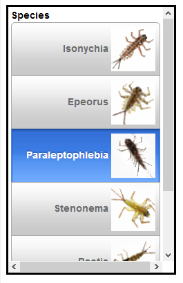
An on-page window with a solid border
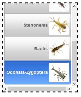
Dash style
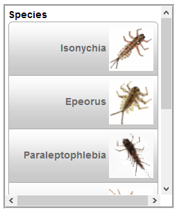
Grooved border style
Border width
Allows you to change the width of a border.
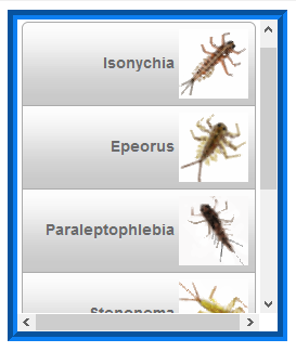
A 9px wide blue grooved border
Border Color
The Border > Color property in the Style Editor lets you change the windows color.
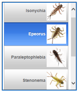
Blue border
Padding
You can place padding between an Embedded object and the on-page window border. In the example below 12px has been placed between the embedded UX component and the on-page border.
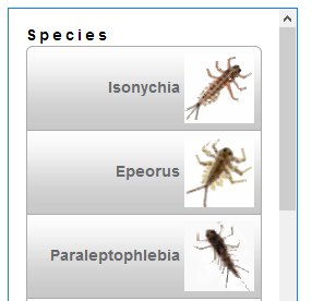
12px padding on 'All' sides
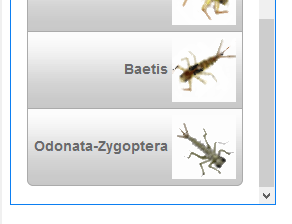
Positioning and Size
Allows you to set where the on-page window will appear in the component. The position can be static, absolute, relative, or fixed.
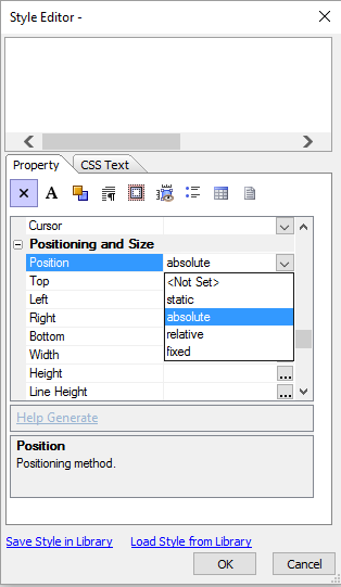
Positioning and size in Style Editor